
 PRACODE.
An Editorial Approach to Modern Web Design
How to compose rhythm, typography, and negative space so that websites tell a compelling story rather than just sell.
Clarity Over Ornamentation
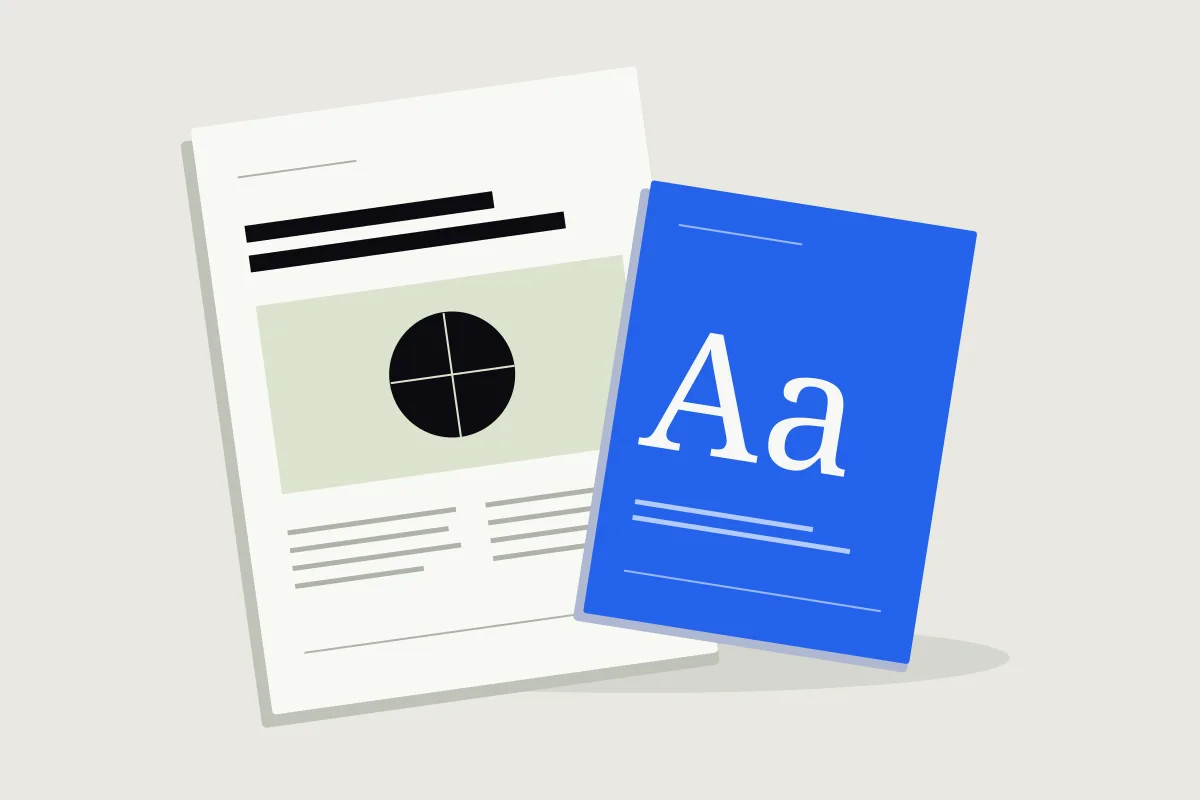
Memorable websites are rarely the loudest with flashy animations; they are the most disciplined in information hierarchy. Thoughtful typography and deliberate typographic scales allow users to absorb core messages effortlessly.
Good design is achieved not when there is nothing left to add, but when there is nothing left to take away.
Our Studio Philosophy
At PRACODE, every screen is tested with editorial rigor: balanced grids, bold hierarchy contrast, and scroll rhythms that respect user attention.